
Landing pages are the most critical component of a web application that can make or break your website in seconds. In digital marketing, these landing pages play a vital role in promotion and marketing campaigns. It is a platform where your potential users visit, once they click any link through email, Google, Instagram, or from other sources. Hence, the companies need to build robust and effective landing pages that help them to attract users in bulk and achieve their business targets.
Today in this blog, we discuss the following points:
- What are the landing pages and their purpose?
- Type of landing pages.
- Software that we can use to build a landing page
- Best examples of the landing page in 2020
But First of all, What is a Landing Page?
A landing page is a standalone web page that is created to attract and convert the general site visitors into potential customers. A landing page comes with a simple design and navigation, and it is designed for a particular purpose. It is built for defining business values and generating leads as well. Landing pages are different from other pages of the website.
Mostly landing pages include features like:
- An explanation of videos.
- Social proofs of the brand.
- FAQS and,
- Why Choose Us sections.
The purpose of a landing page is to serve better to people who showed their interest via ads.
What are the types of Landing Pages?
There are different types of a landing page, such as:
- Click-through landing page –These types of landing pages quickly give you details about the offer you clicked on. Once you clicked on an ad, they’re-direct you to the website’s checkout page where you could make a purchase.
- Lead generation landing page – These type of landing pages takes the information of the visitor who tours the website. The page contains a simple form of inquiry that requires name, email, phone number, etc. of the visitor. Such kind of landing pages is widely used for marketing.
- Infomercial landing page – These pages are very long in size about 50ft; users need to scroll it a lot. It includes a detailed sales message which automatically develops an interest in the visitor to check it in detail.
Other types
- Home page
- Microsite landing page
- Viral landing page
What Factors should be Considered while Developing a Landing Page?
Consider the following point to give the best experience to the user and to build the best landing page as well.
- Structure pattern
- Develop a clutter-free design
- Use click to call and click to scroll
- Use headers and footers
- Follow the hierarchy and mobile approach
- Thank you! -this page is a must. So, don’t forget to add at the end of the page.
- Page loading time
- Normalize the design of buttons, forms, and grids
- Responsive and readable.
What is a Landing Page Builders and which are the popular Landing Page Builders?
Builder is the best tool to build landing pages faster to get leads, surveys, and for experimenting on ideas. You can use a builder to create landing pages for eCommerce websites, for marketers, for researchers, and creators.
But which building tool is best. Well, there are so many tools available in the market. It mainly depends upon your project requirement that which one will perfectly suit them. Here we’ve listed some popular builder tools below. So, check it out.
Best Landing Page Builder Application
1. Marketo Landing Page
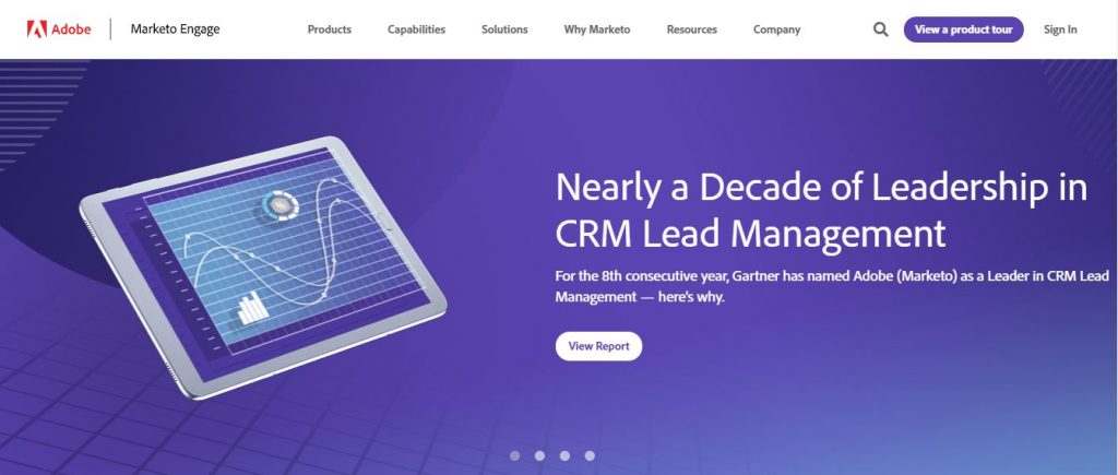
What the page does well?
- Headlines clearly deliver the intent of the page.
- Pre-download images on the page clearly show insights of what receivers can expect when they download the report.
- Bulleted lists allow users to quickly scan through the report contents.
- Reports are backed by social proof like customer testimonials, company badges, etc. to garner customer trust.
What could be done right?
- Exits Links including Marketo logo and legal link provide additional exit choices to the visitor which could lead them to exit the website even before they download it.
- Long form that includes 5 fields can be daunting for customers in the consideration stage. Irrelevant fields such as “Job Title” and “Company” could be removed.
- CTA button colors don’t stand out.
- CTA button copy can be made more specific and customer-friendly in a way that encourages people to click.
- Large blocks of italicized content turn down the visitors.
- Headshot along with the customer name would add great value to the credibility.
- Adding some white space to the page would make it more aesthetically appealing.
2. Slack
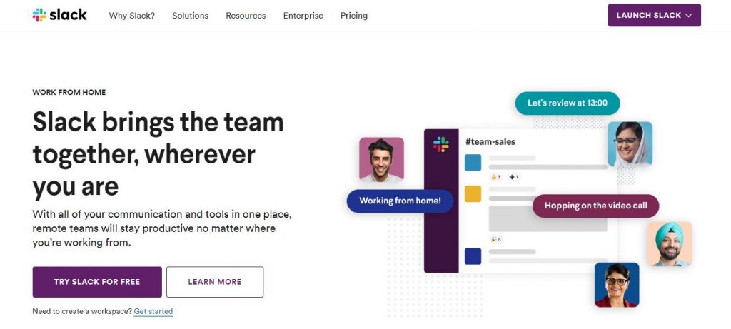
What the page does well?
- Unique scrolling style allows the display of necessary information only without move up and down the page often.
- Lead capture form is present whether the visitor scrolls up or down the page.
- CTA Button copy is short, compelling, direct, and uses the word “Free”, leading to higher CTRs.
- Single field form make it very likely for the visitors to complete the form.
- Only one form field makes it highly likely that visitors will complete the form.
- The images are bright, engaging, use brand colors, and are relevant to each corresponding section.
- Use of social proof is likely to make visitors feel compelled to use Slack.
What could have been done better?
- There are several exit links, including the Slack logo, “Sign in,” “See all apps,” “See customer stories,” “product,” “pricing,” and “Enterprise Grid” — making it more likely for visitors to leave the page without converting.
- No privacy policy might deter prospects from handing over their email address.
3. Oracle
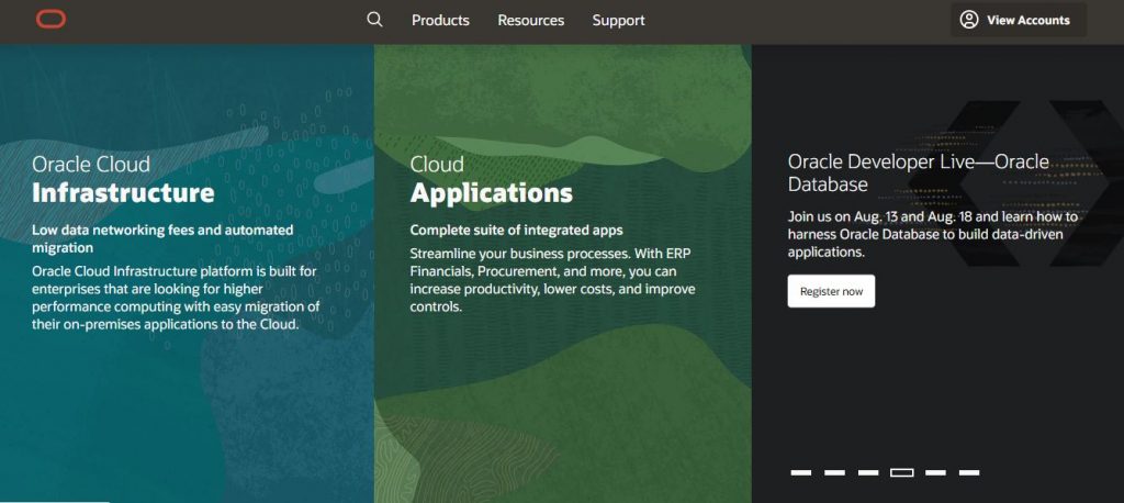
What the page does well?
- The Demand Gen Report statistic in the copy isn’t “recent” like it states — it’s from before 2016, while the copyright date on this page is 2017.
- The image of the white paper provides visitors with a preview of what they can expect to receive by downloading the white paper.
- The contrasting color of the form stands out and draws attention, enticing visitors to complete it.
- The unchecked opt-in box ensures that prospects who opt-in want to receive emails from Oracle.
What could have been done better?
- The company logo and navigation at the top of the page could potentially remove visitors from the page without downloading the white paper.
- The small copy on and beneath the form fields is difficult to read.
- The white CTA button doesn’t stand out as much as it could because there is white at the top and bottom of the page.
- Exit links in the footer provide visitors with even more ways off the page.
4. Google Hire
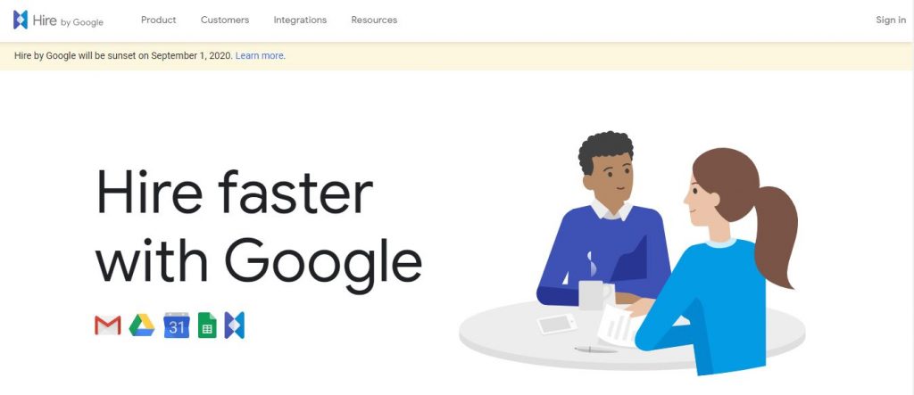
What the page does well?
- The Hire logo in the top left corner immediately lets visitors know where they are when they land on the page. The fact that it’s not hyperlinked also won’t let people click away making this a great post-click landing page.
- The clear headline tells prospects the demo will include information about recruiting tools.
- Minimal, to-the-point copy allows visitors to quickly read through and determine if they want to convert on the offer.
- Encapsulating the form helps it stand out on the page, likely increasing conversion rates.
- The privacy policy link in the footer adds trust value, making prospects feel more comfortable with submitting their personal information.
What Could be Done Better?
- Message match could be improved. I was taken to this post-click landing page from a Hire webinar promotion with a CTA button encouraging visitors to “Sign Up” for the “upcoming webinar”. The post-click landing page does not mention a webinar at all, but instead, promotes an on-demand demo. If Google Hire considers their webinar and demo to be the same thing, increasing the message match between the two pages would likely diminish any confusion in visitors.
- 14 form fields is a lot, even for the consideration stage of the marketing funnel. Breaking this up into a multi-step form could reduce form friction and result in more conversions.
- The turquoise CTA button is similar to the other shade of blue on the page. Making it more contrasting, like orange, would make it “pop” more.
- The page is unbalanced. Including an additional post-click landing page element to the left of the bottom of the form, such as a customer testimonial or an engaging image, could make the page more aesthetically pleasing.
5. Uber
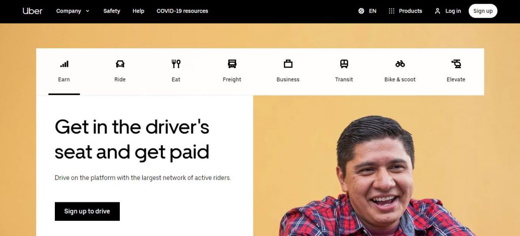
What the page does well?
- The Uber logo at the top of the page immediately lets visitors know where they are. The fact that it’s not linked to the homepage acting as an exit link is also a plus.
- 5 form fields are appropriate for a signup page, especially since they don’t ask for very personal information.
- The optional promo code field is smart because it doesn’t appear unless prospects click, keeping the form limited to 5 fields.
- The green CTA button stands out because there’s no other green on the page.
- The arrow on the CTA button acts as a directional cue, indicating that visitors should click to see what’s on the other side of this post-click landing page.
What could have been better?
- Hardly any copy on the page might leave visitors feeling under informed and uncertain.
- Adding social proof, such as a quoted testimonial from a current Uber rider, might instill more trust in visitors.
- The “Sign up” copy on the CTA button is not original or personalized. “Get a ride now!” is more descriptive and exciting.
6. IBM
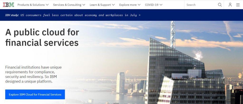
What the page does well?
- The headline is distinct and intriguing, compelling visitors to continue down the page to learn more about the offer.
- Minimal copy provides a brief overview of the white paper without overwhelming prospects with unnecessary information.
- Providing the option to switch languages is a great idea in theory. Unfortunately, when visitors select another language, they’re brought to the homepage instead of directly translating this post-click landing page.
What could be better?
- Header and footer navigations could easily distract visitors from the present offer and send them away from the page without converting.
- Balancing the page by adding an image or customer testimonial on the left side would make it more visually appealing.
- The CTA button could be improved according to our post-click landing page best practices. The color could be more contrasting and attention-grabbing, and the copy could be more customer and benefit-oriented.
7. LendingClub
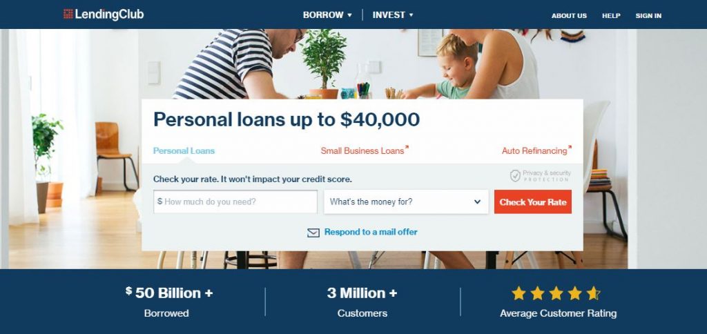
What the page does well?
- The headline uses bold formatting to highlight the value proposition.
- Encapsulating the form with color contrast makes it attention-grabbing.
- The red CTA buttons contrast and stand out on the page, likely increasing conversions.
- The “Investing through LendingClub” section provides the main benefits of partnering with the company, without filling the page with overwhelming amounts of copy. Plus, the specific percentages of investments serve as social proof.
- The company logos also act as social proof and let visitors know that many big-name brands recognize and trust LendingClub.
- Multiple CTA buttons provide prospects several chances to convert on the offer.
What could be better?
- Multiple exit links — the LendingClub logo, “terms of use,” “Learn more,” several words in the fine print, and the footer navigation — could remove visitors from the page without converting.
- Shifting the direction of the man’s eyes in the photo to look at the lead capture form might subconsciously encourage more visitors to complete it.
- Changing the CTA button copy to something more engaging and compelling like, “Start investing now and earn returns!” may result in more conversions.
- The excessive amount of fine print at the bottom of the page is intimidating and could make prospects wonder if the company has a hidden agenda.
8. Microsoft
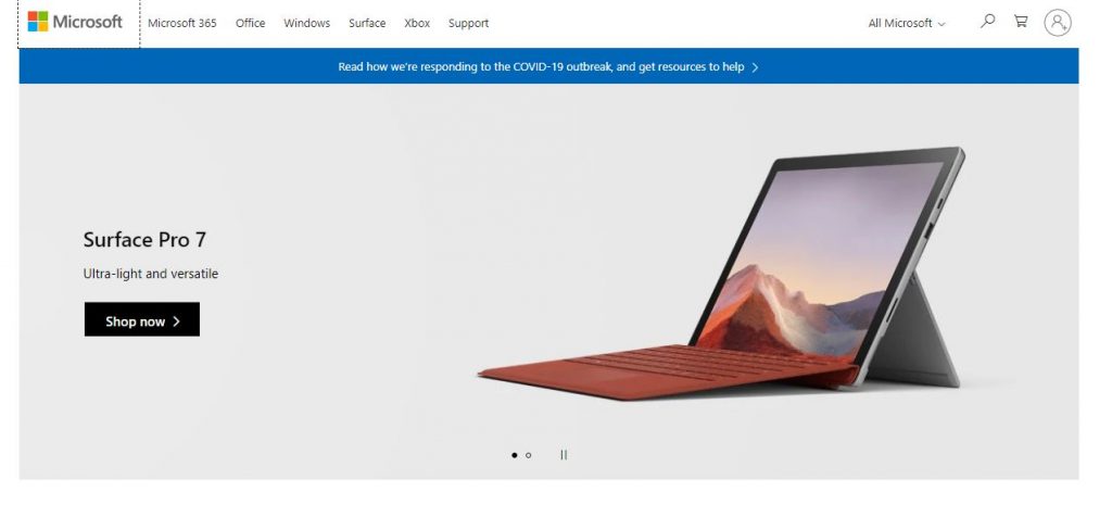
What the page does well?
- A benefit-oriented headline lets visitors know that they could improve their team’s mobile productivity with Office 365 and encourages them to learn more with the ebook.
- The product image shows prospects what they’ll receive if they choose to download the ebook. Enlarging it and making it more realistic might improve conversion results even more.
- Bullet points with minimal copy allow prospects to scan the page for the relevant information.
- The encapsulated form stands out, directing a visitor’s attention to complete it.
- The green CTA button is attention-grabbing because it contrasts well with the rest of the page.
What could be better?
- The hyperlinked Office logo could take visitors away from the page without seeing the offer and converting.
- The image of the man seems irrelevant to the offer. Replacing it with a person using Office 365, or reading the ebook, could be more efficient.
- Eight mandatory form fields might be intimidating for somebody who’s only in the consideration stage of the buyer’s journey.
- The CTA copy isn’t precise or enticing. Changing it to something more personalized and exciting like, “Send me the eBook!” would likely encourage more prospects to click.
- “See plans and pricing” at the bottom of the page might distract visitors from the main offer and prevent them from converting.
- Adding social proof, such as a customer testimonial or trust seals, would increase credibility.
Conclusion
We hope that you are cleared with what are landing pages, landing pages builders, and with the help of examples, you get inspired to build your landing page for a website. Consider the critical points that we mentioned above to design the best and attractive landing page. And if you are looking for expert help, then feel free to reach out to us.